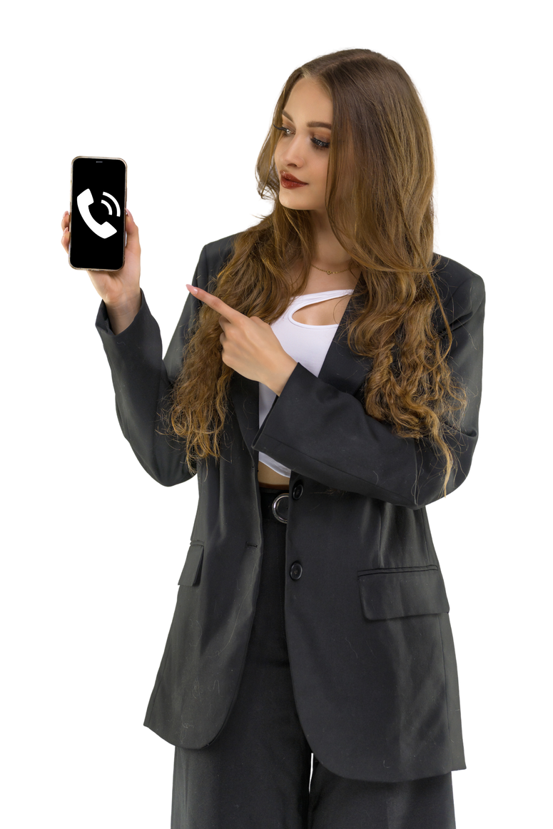
Graphic & website designer
kontakt@agathakot.pl


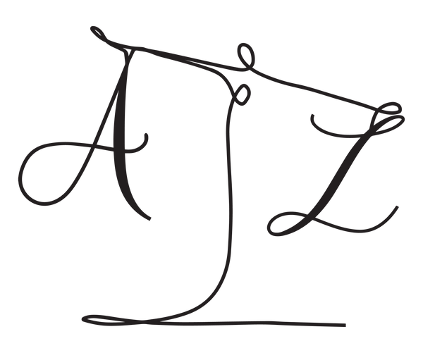
Agatha
KOT


welcome to
my portfolio
ChOOSE LANGUAGE:
(ZMIEŃ JĘZYK)

TOOLS


About Me
I am a student at the Faculty of Finance and Management at the WSB University in Wroclaw. I have experience in designing social media materials, copywriting and creating advertising campaigns. I am a creator who can use analysis and imagination to create clear content with exceptional results. I have the ability to work effectively in a team and adapt to a constantly changing work environment, using problem-solving methods when necessary. I approach every situation and idea with enthusiasm and I quickly learn new things, willingly using all the knowledge I have acquired. My dream is to create things that are necessary and useful for others. Graphics, marketing and website design are not only my job, but also a passion that I want to develop.
experiences
education
Halo Radio Taxi Kędzierzyn-Koźle
Graphics and advertising manager
august 2020 - december 2023 · 3 years 5 mon.
Graphics and advertising specialist
september 2018 - august 2020 · 2 years
Intern in the social media department
july 2018 - september 2018 · 3 mon.
Uniwersytet WSB Merito we Wrocławiu
Wrocław | 2021 - 2024
Bachelor degree
Faculty: Finance and Management
Major: Marketing and social media
Language
contact
Skills

- kontakt@agathakot.pl
- +48 514 014 796
- linkedin.com/in/agatha-kot
- logo design
- brand identity
- websites
- advertising
- poster design
- social media design
TABLE OF CONTENT
01
Agnieszka Ziaja
Poleathome
02
Halo Radio Taxi
BABOR Beauty
03
Łukasz Jaroszewski
Agnieszka Ziaja
Sandra Musioł
Grzegorz Kodź
05
Originality
Augenblick
Dreaming
Life
04
Poleathome
Halo Radio Taxi
01
Logofolio
Logofolio
01
Agnieszka Ziaja
advocate Office
2023
Overview
Logo of law firm focuses solely on the weighing scale as the main element. The scale is placed centrally in the logo, thus symbolizing equality and justice. Scale is one of the attributes of Themis, the Greek goddess of justice, law and eternal order. Its balance refers to the attention to every detail and the fair approach that the law firm provides to its clients.
Core Value
Taste
Luxury
Scale
Keyword
Lawyer
Justice
Modern
Colors
#006B55
#000000
#FFFFFF
Typeface
Montserrat
Logotype

Horizontal logo

Symbol
Logofolio
02
Poleathome
online courses
2023
Overview
The Poleathome logo mainly depicts a pole dancing figure called a "broken heart". The figure is placed centrally in the logo, representing one half of the heart. There is a home around the figure and the heart. The house symbolizes the possibility of exercising at home, and the heart combined with the house creates the warmth of home, just like the instructor creates during the courses.
Core Value
Warmth
Simple
Passion
Keyword
Pole
Courses
Modern
Colors
#ED7BA7
#000000
#FFFFFF
Typeface
Bellota
Logotype

Horizontal logo

Symbol

02
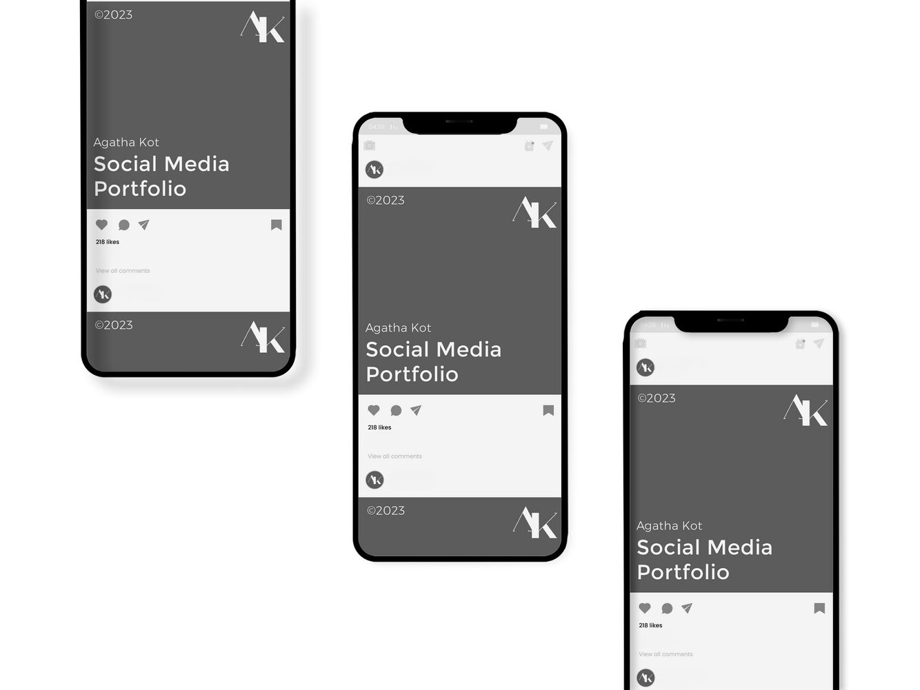
Social Media
Social Media
01
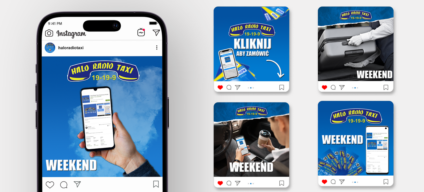
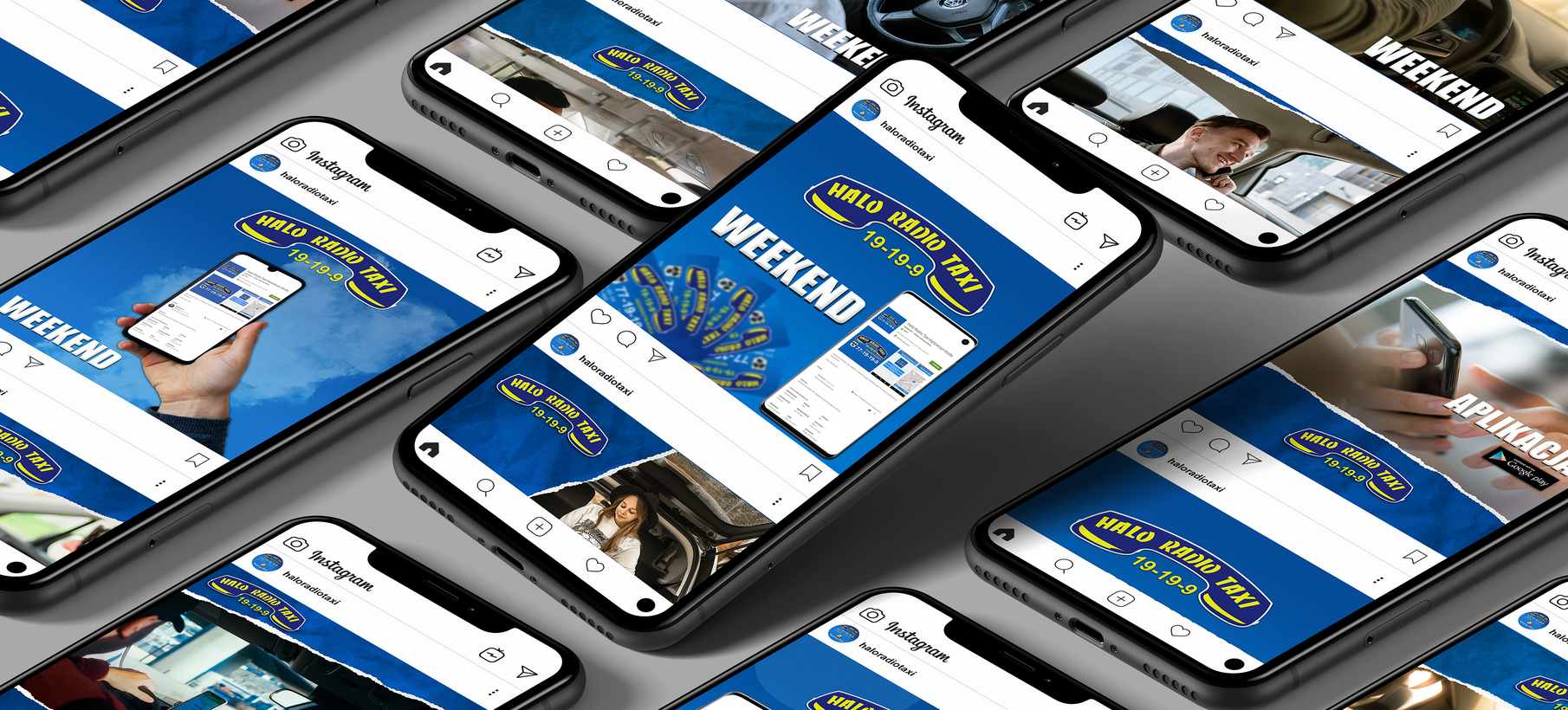
Halo Radio Taxi
transport company
2018-2023
Scope of works
Content Plan
Instagram Feeds
Instagram Story
Photo Editing
Facebook Page
Customer Service
Copywriting
Facebook Ads
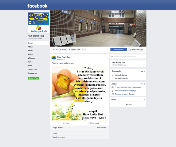
Site in 2018
Facebook site
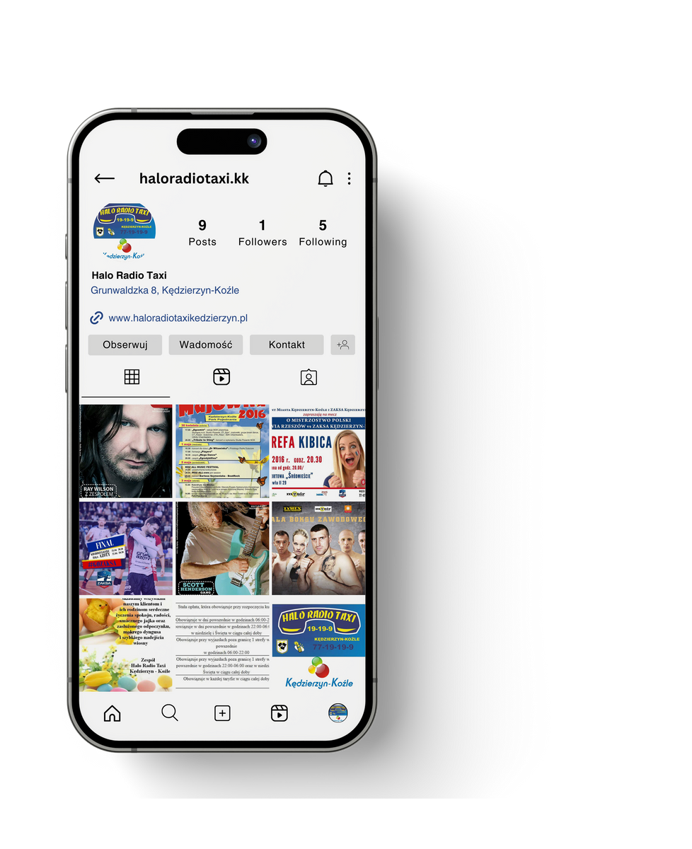
In 2018, I started working with the company. Despite my client's efforts, the website looked unprofessional and the posts often did not reach potential customers as expected. Just 28 likes and minimal reactions were a testament to the low activity of the online community. The reach was negligible, which affected the client's visibility among potential recipients.
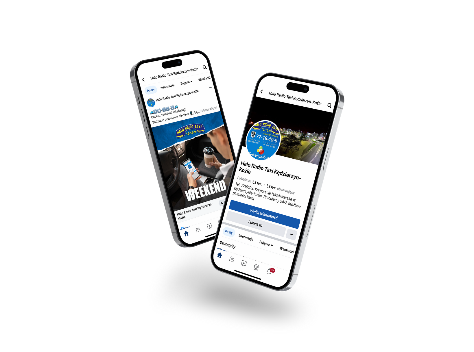
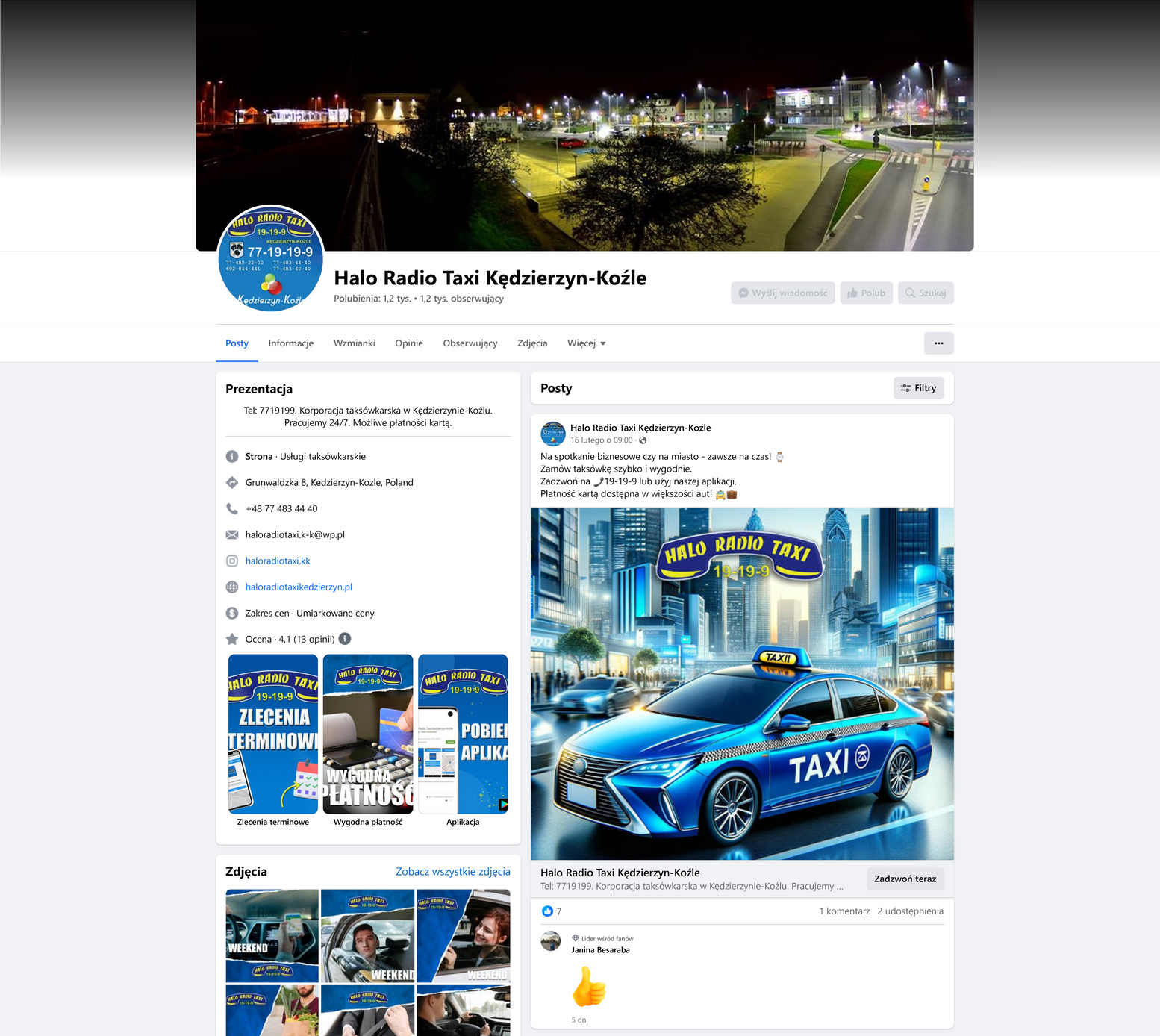
Site in 2024
Facebook site
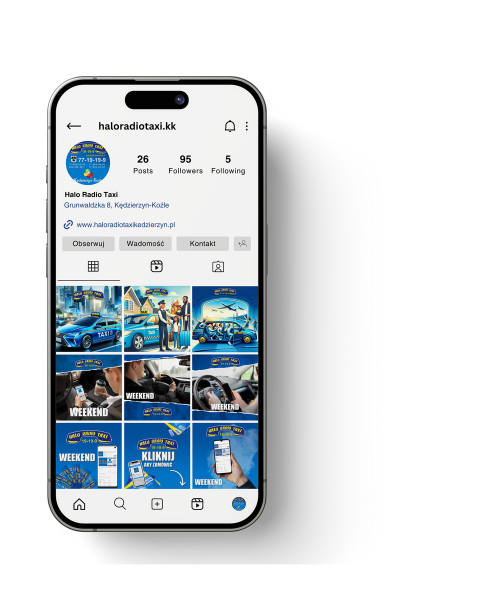
Thanks to my persistent work and commitment, I managed to achieve a significant increase in reach, which currently reaches over 10,000 people, which is a lot for a city with 50,000 inhabitants. We also managed to gain 1,300 likes and a large number of reactions, which is a clear signal that the online community is growing dynamically and actively participates in the life of my client's company. Currently, the website is professional, attractive to customers and effectively attracts interest. A noticeable increase in customer inquiries and contacts confirms that the marketing strategy has been successful, contributing to increased customer trust in the local community. As the person responsible for running the website, I am happy with the results achieved and the effectiveness of activities.

Social Media
02
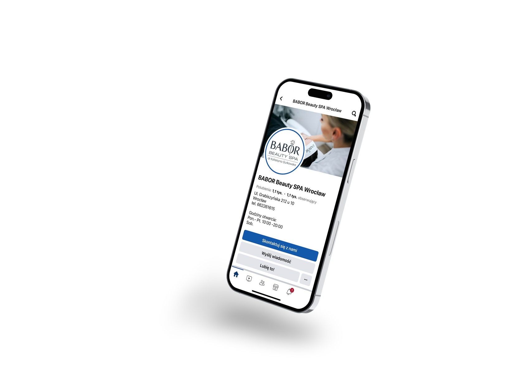
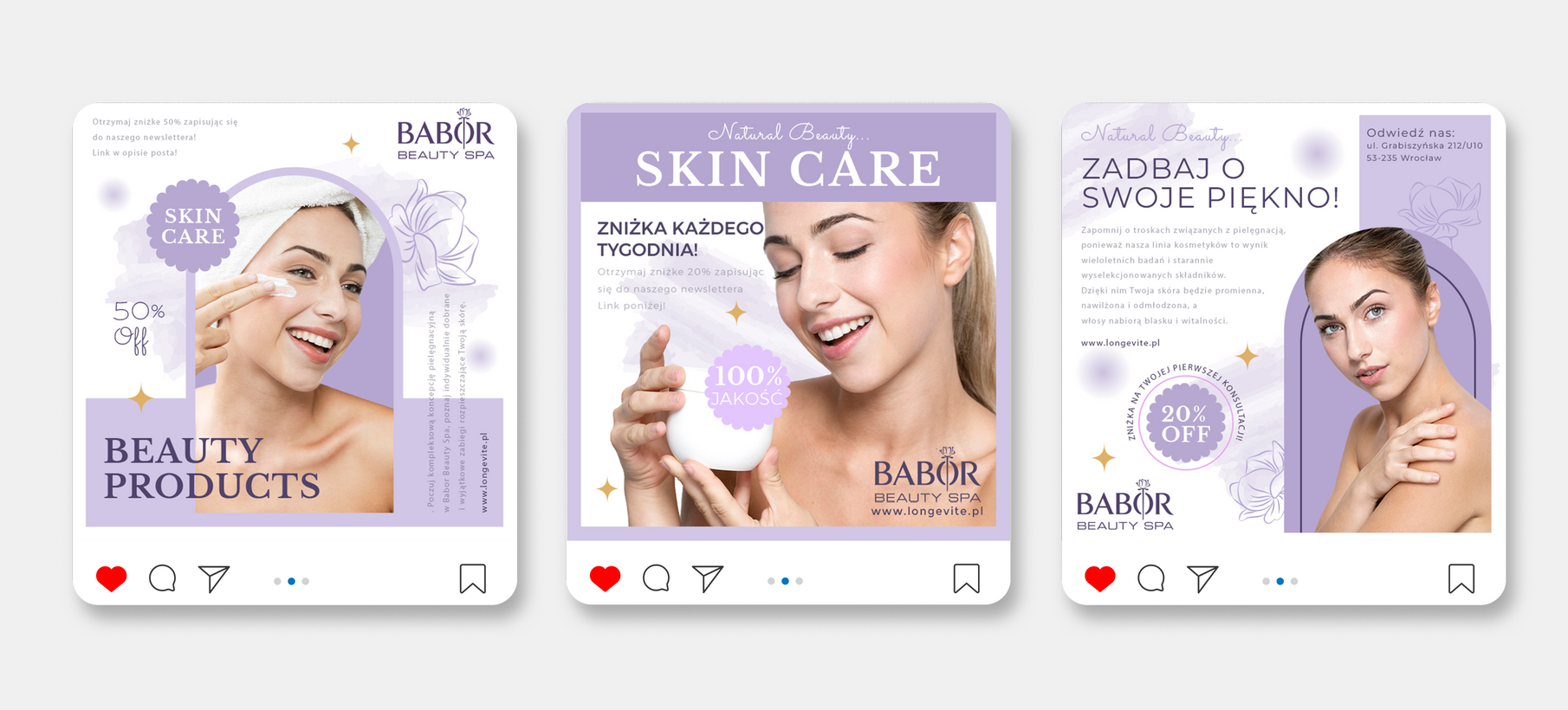
BABOR Beauty
beauty company
2022
Scope of works
Content Plan
Instagram Feeds
Photo Editing
Facebook Ads
Copywriting
03
Brand Identity
Brand Identity
01
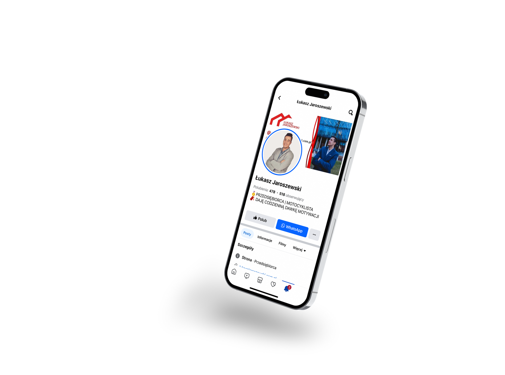
Łukasz Jaroszewski
Real estate agent
2022
Scope of works
Content Plan
Instagram Feeds
Instagram Story
Photo Editing
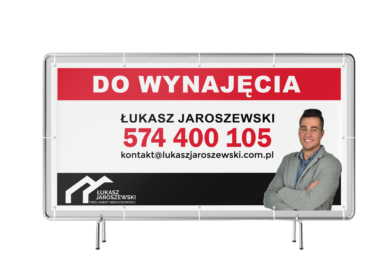
Banners
Facebook Ads
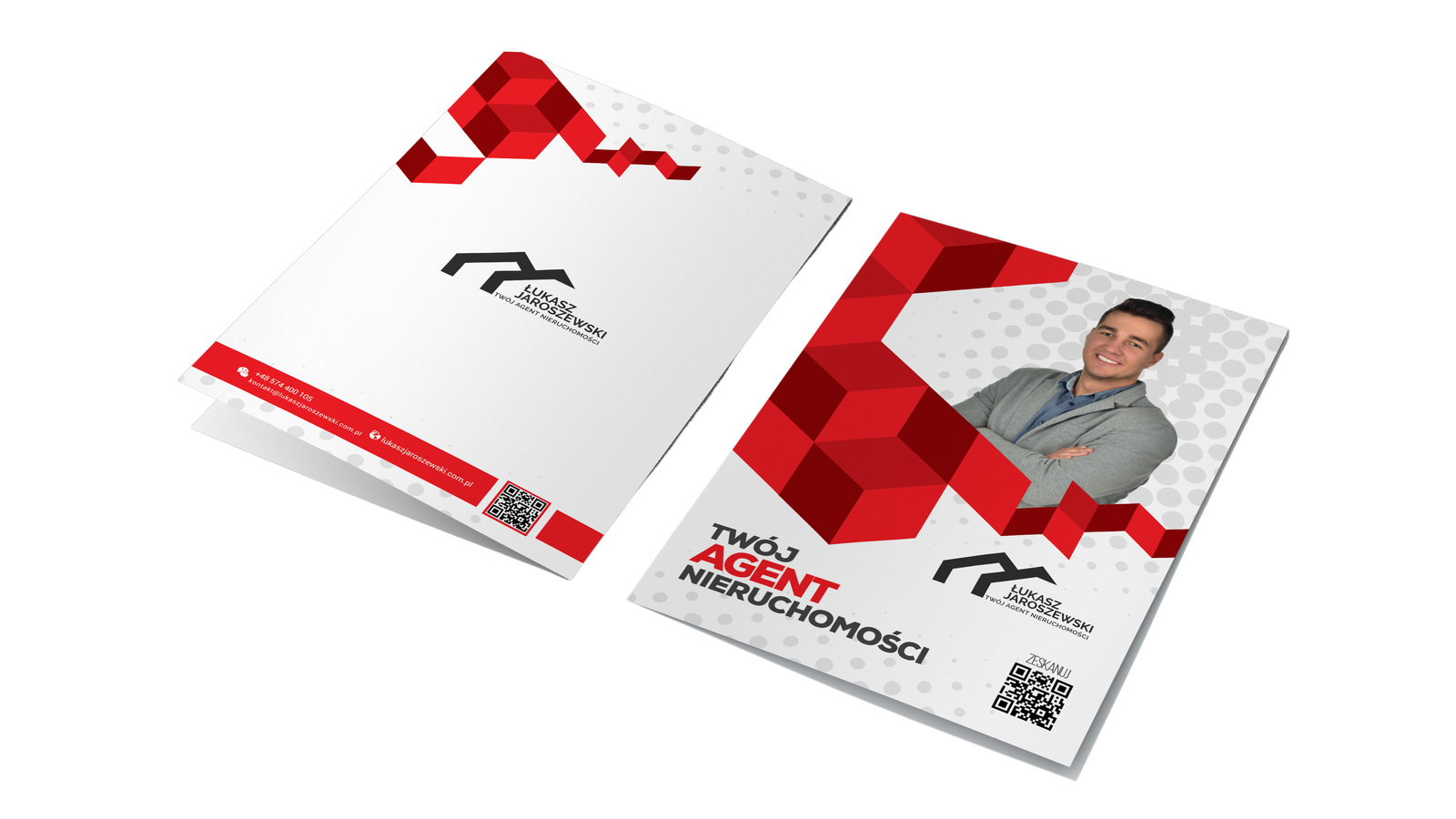
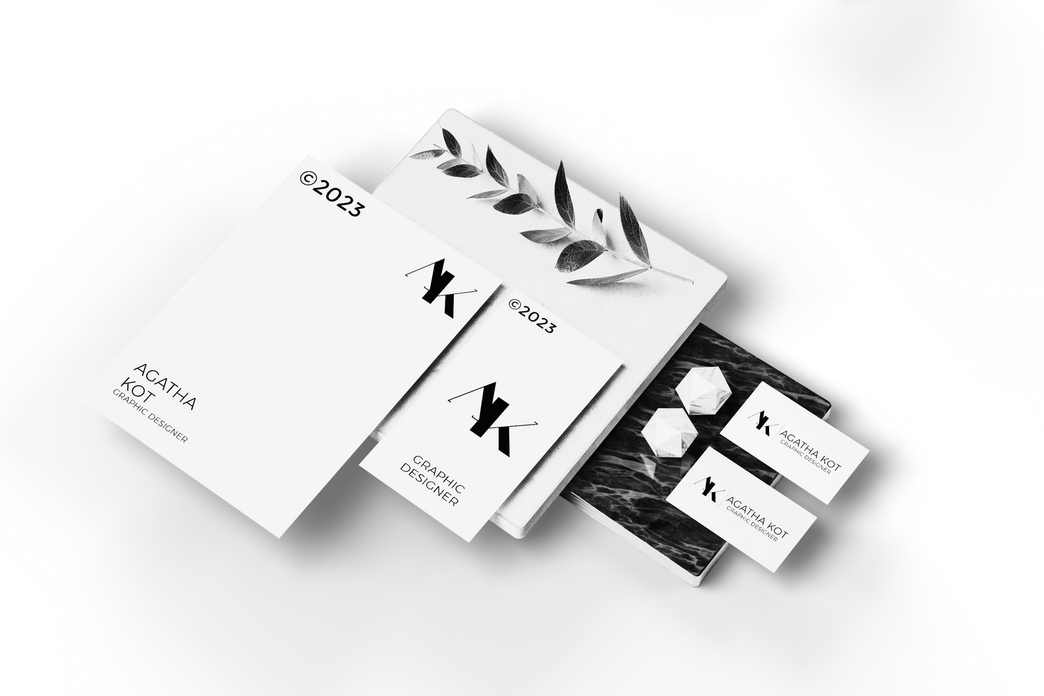
Document folder
Brand file
The brand file is designed with 2 colors of identity, which are white and red, containing horizontal logo, face of the founder and QR Code.
Brand Identity
02
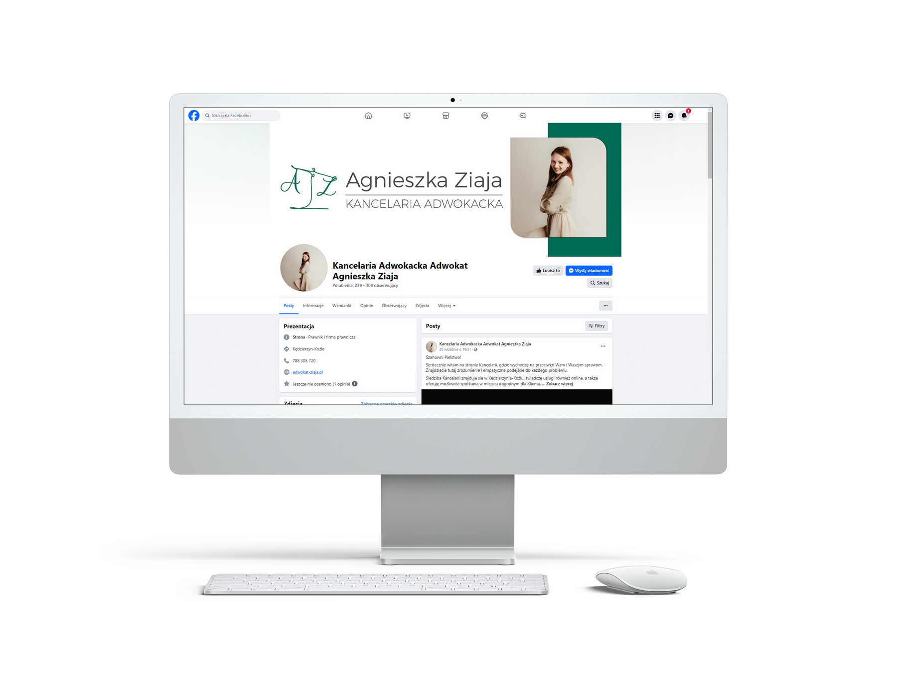
Agnieszka Ziaja
advocate Office
2023
Scope of works
Facebook
Photo Editing
Office Papers
Banners
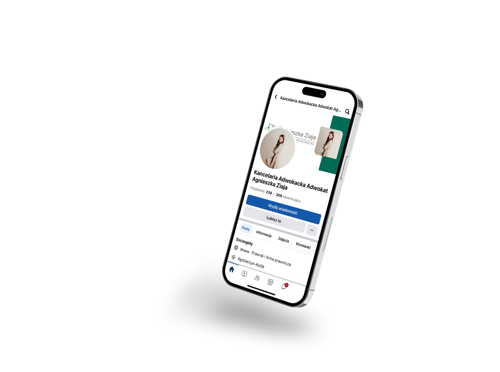
Banner
Facebook site
The banner is designed with 2 colors of identity, which are white and green, containing horizontal logo.
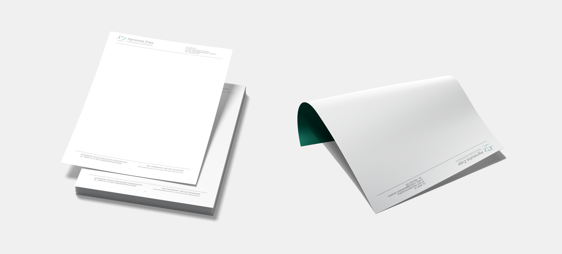
Office Papers
Header and footer
A simple footer and header for use in many documents needed in a law firm. It contains only the most important things - logo, address, REGON number, account number for transfers.
Brand Identity
03
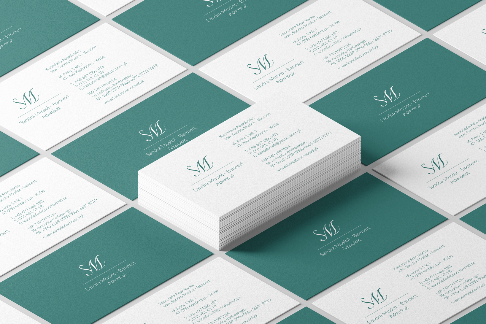
Sandra Musioł
advocate Office
2022
Scope of works
Facebook
Photo Editing
Bussines cards
Avatar
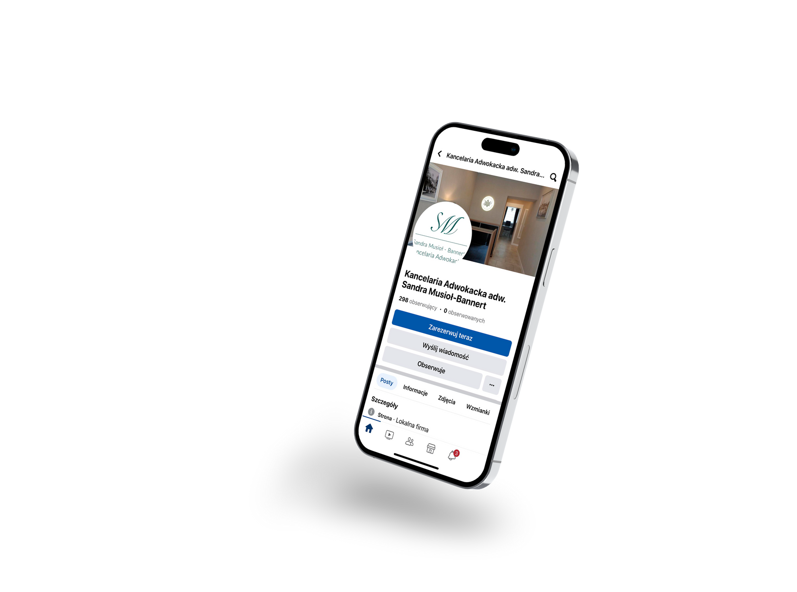
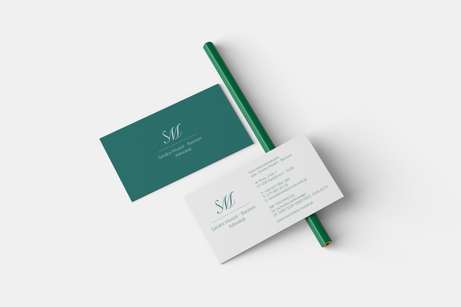
Business cards
Simple design
This simple design focuses on functionality, contains 2 colors of identity, which are white and green. These colors symbolize law firms.
Brand Identity
04
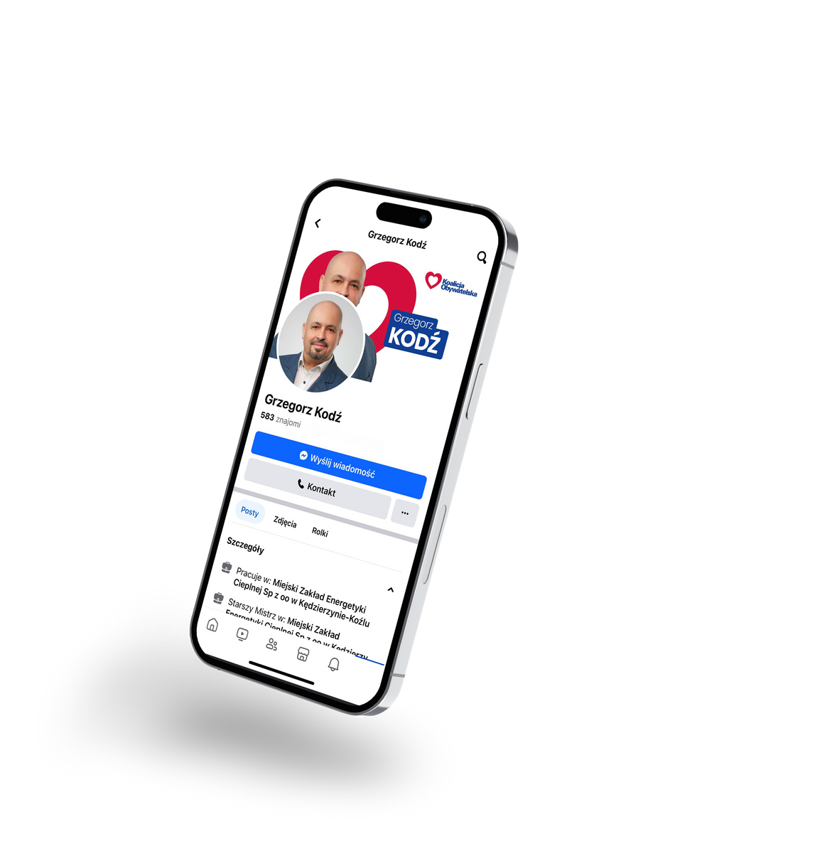
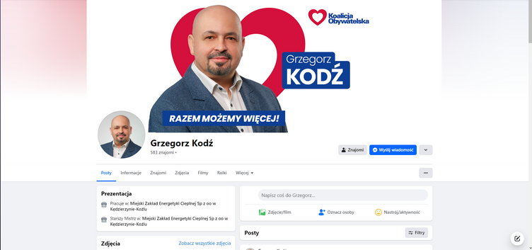
Grzegorz Kodź
politician
2024
Scope of works
Facebook
Photo Editing
Election Banners
Election Flyers
Election Posters
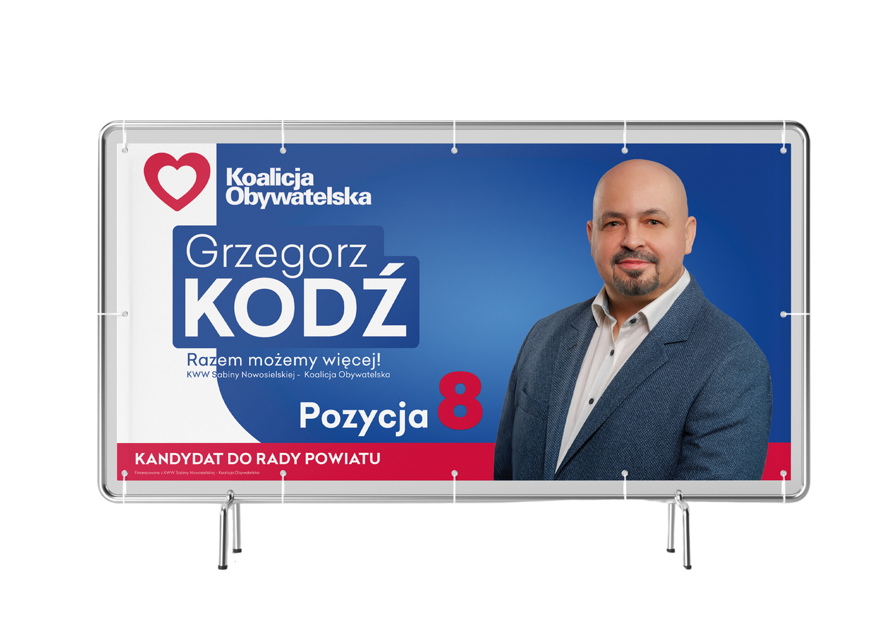
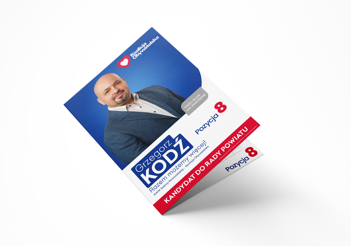
Banner
Facebook site
Created in two main colors - red and blue, the campaign banner exudes energy and determination, symbolizing the candidate's commitment to serving the Koalicja Obywatelska.
Slogan "Together We can do more!" perfectly reflects the main message of Grzegorz Kodź's campaign, emphasizing his commitment to cooperation and building a better future for the inhabitants of Kędzierzyn-Koźle County.
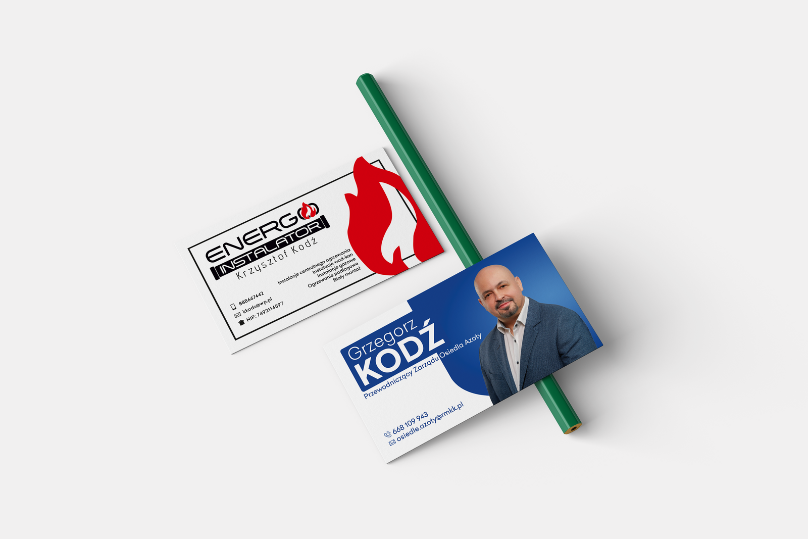
Business cards
Advertising design
This simple design is intended to be an information card for Grzegorz, but it is also intended to serve as advertising for his son, who deals with heating installations.
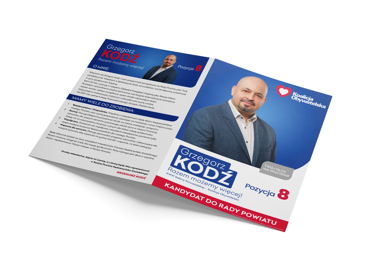
Election Flyers
Outside
The campaign leaflet, was designed with a distinct and professional look in mind, which attracts the attention of potential voters.
The outside of the flyer features a dynamic introduction of the candidate, along with a brief description of their experience and goals.
The entire project was carefully planned so that the leaflet was legible, easy to notice and remember. It is an ideal tool that aims to effectively convey the candidate's message and remain in voters' minds as a symbol of commitment and professionalism.
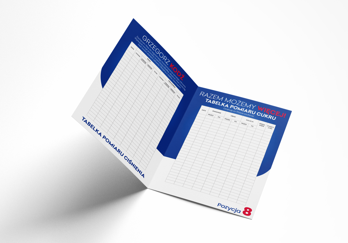
Election Flyers
Inside
The flyer not only presents the candidate and his goals, but also contains a practical function in the form of two tables for blood sugar and blood pressure measurements. This functionality was designed with the needs of older people in mind, who often monitor their health and can use the flyer on a daily basis.
The overall design focuses on durability and usability, ensuring that the leaflet not only attracts attention, but also stays in residents' homes for longer, acting as a useful tool for everyday health care.
04
Websites
Websites
01
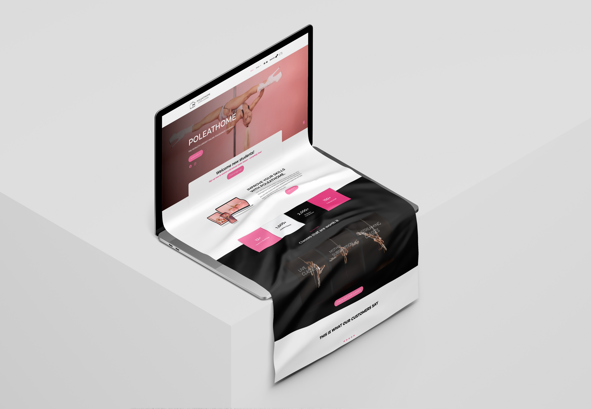
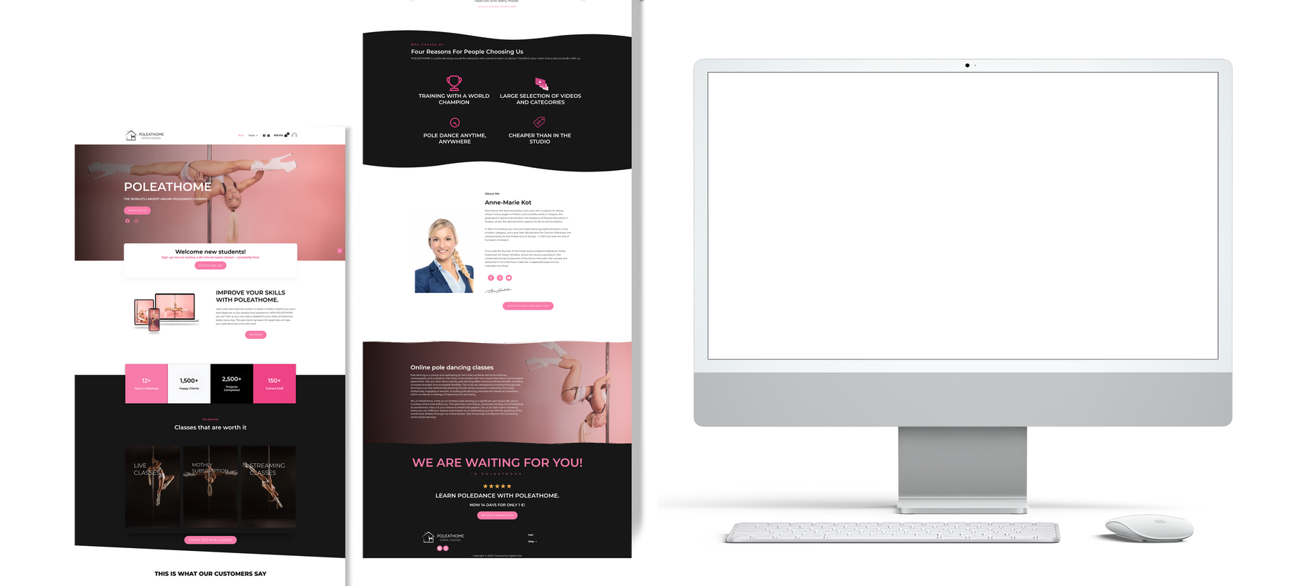
Poleathome
Online courses
2023
Overview
The aim of this website is to create a space where everyone, regardless of their level of advancement, can find inspiration, instruction and support to develop their pole dancing skills. I believe that everyone can discover the beauty and power of this dance, this website aims to make this achievable for as many people as possible.
Websites
02
Halo Radio Taxi
transport company
2024
Overview
This website has been created to provide easy access to reliable and efficient taxi services for everyone. My main goal is to keep the look simple and comfortable for everyone. I want everyone to be able to use the company's services with ease and confidence, knowing that they can rely on their reliable service.
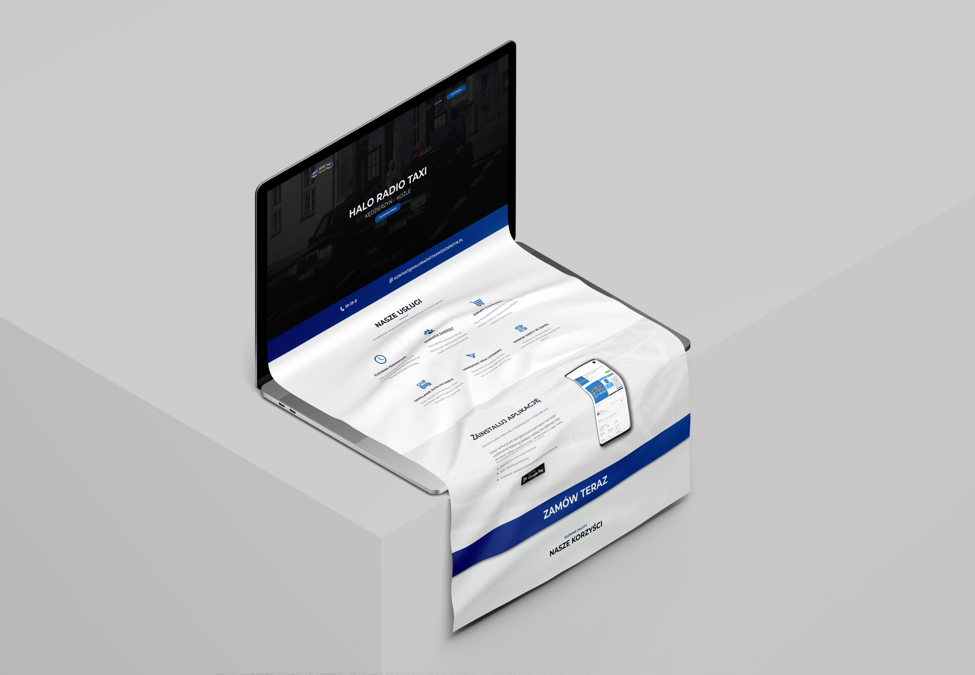
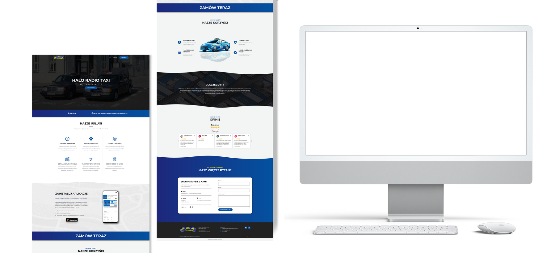
Old site
Website
The website was outdated, I was asked to rebrand the website to make it look modern and attract new customers. The old website was not responsive and its appearance was off-putting. The new website is user-friendly, presents the most important information and encourages contact with the company.
05
Poster
01
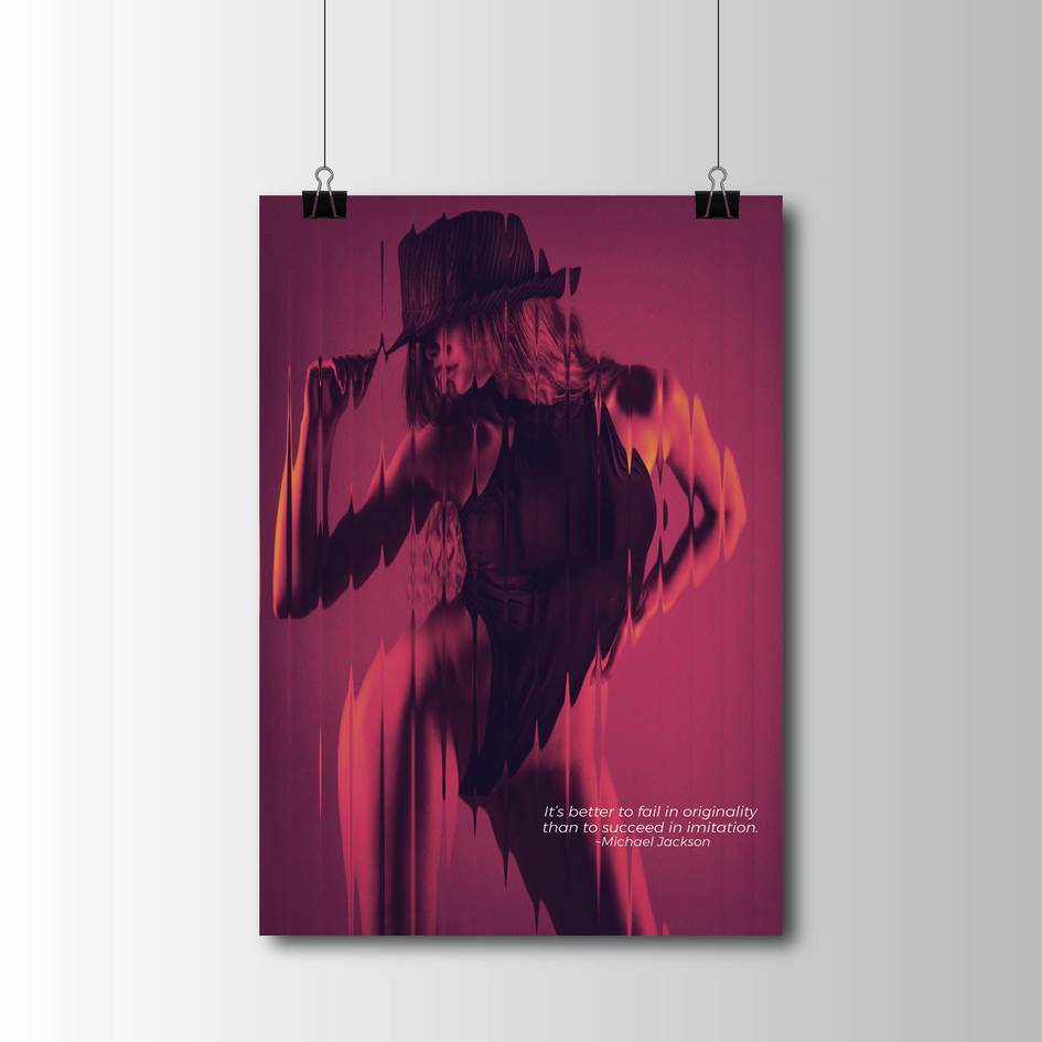
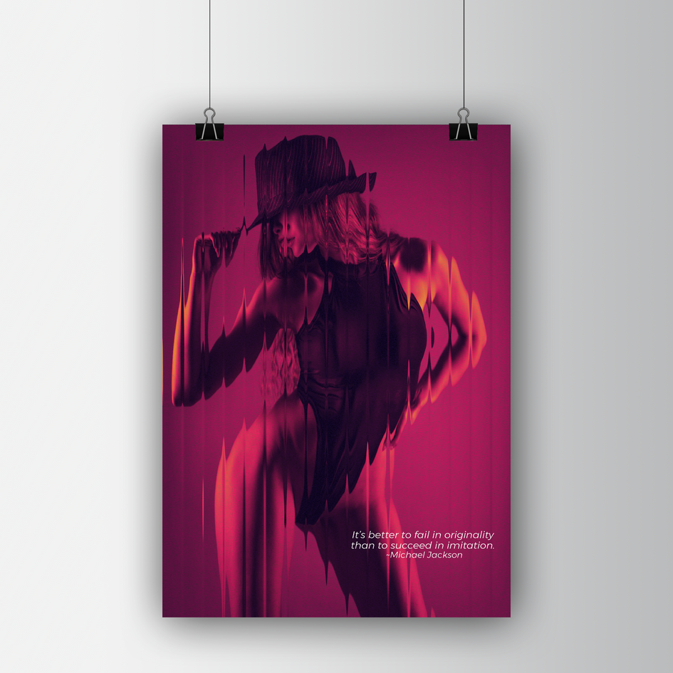
Originality
02
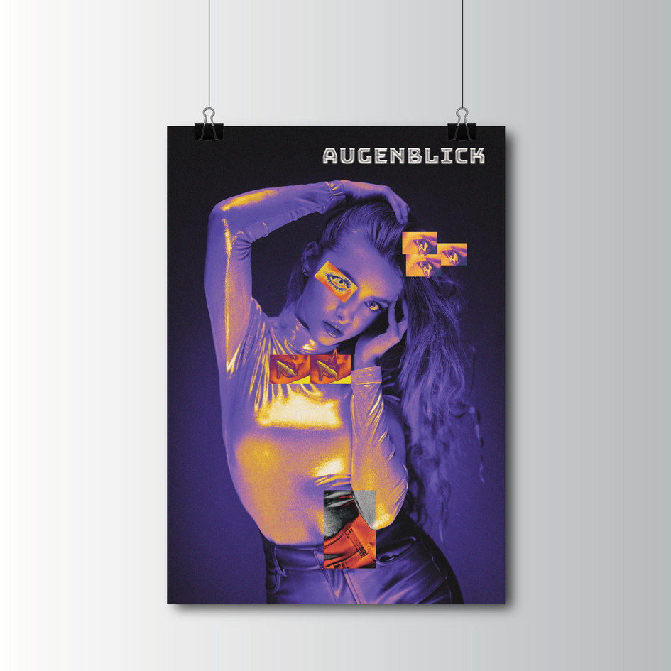
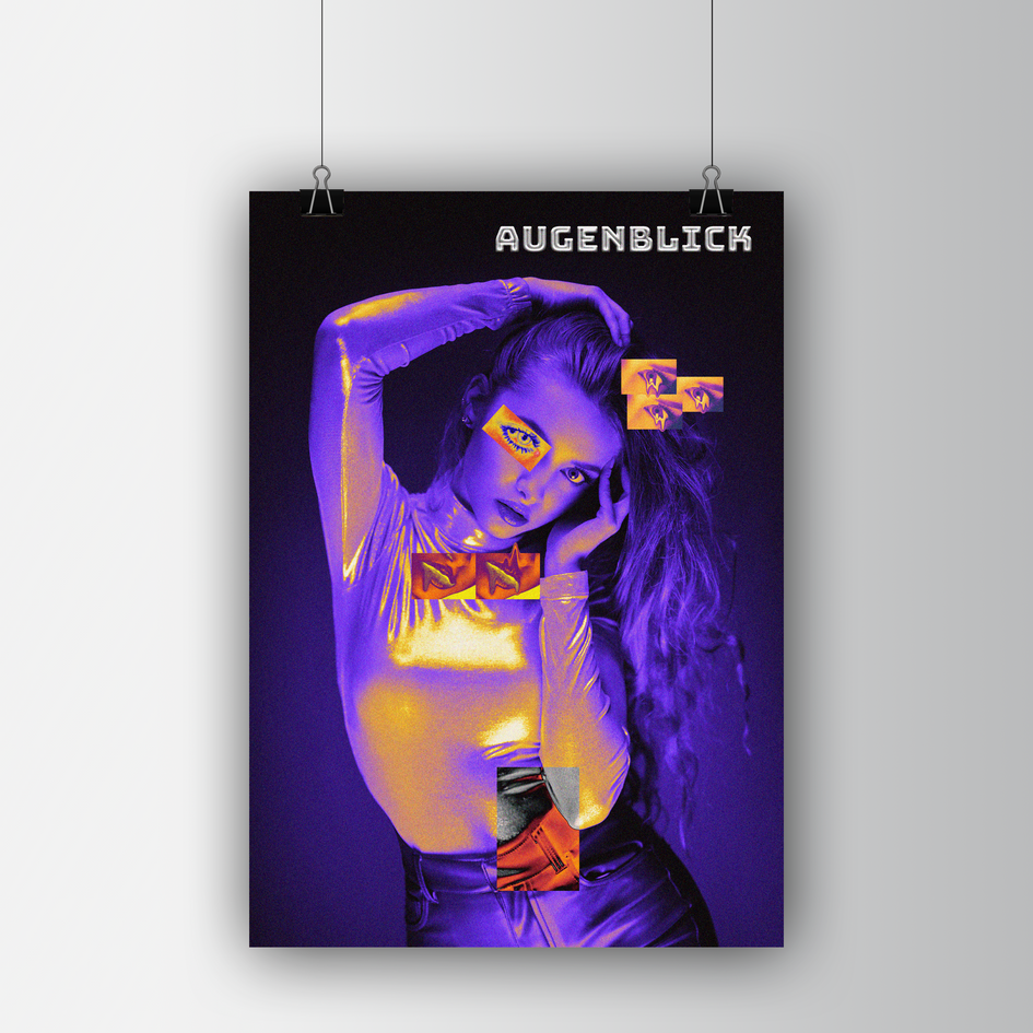
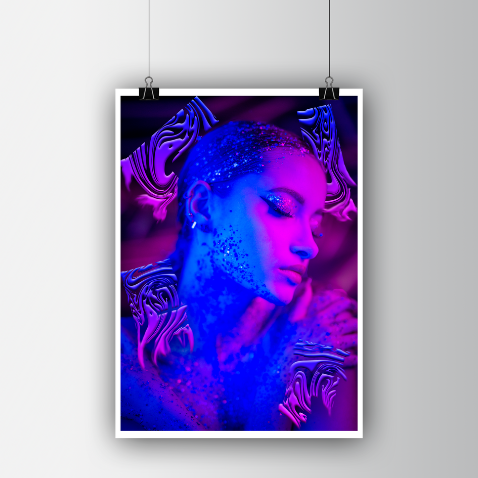
Augenblick
03
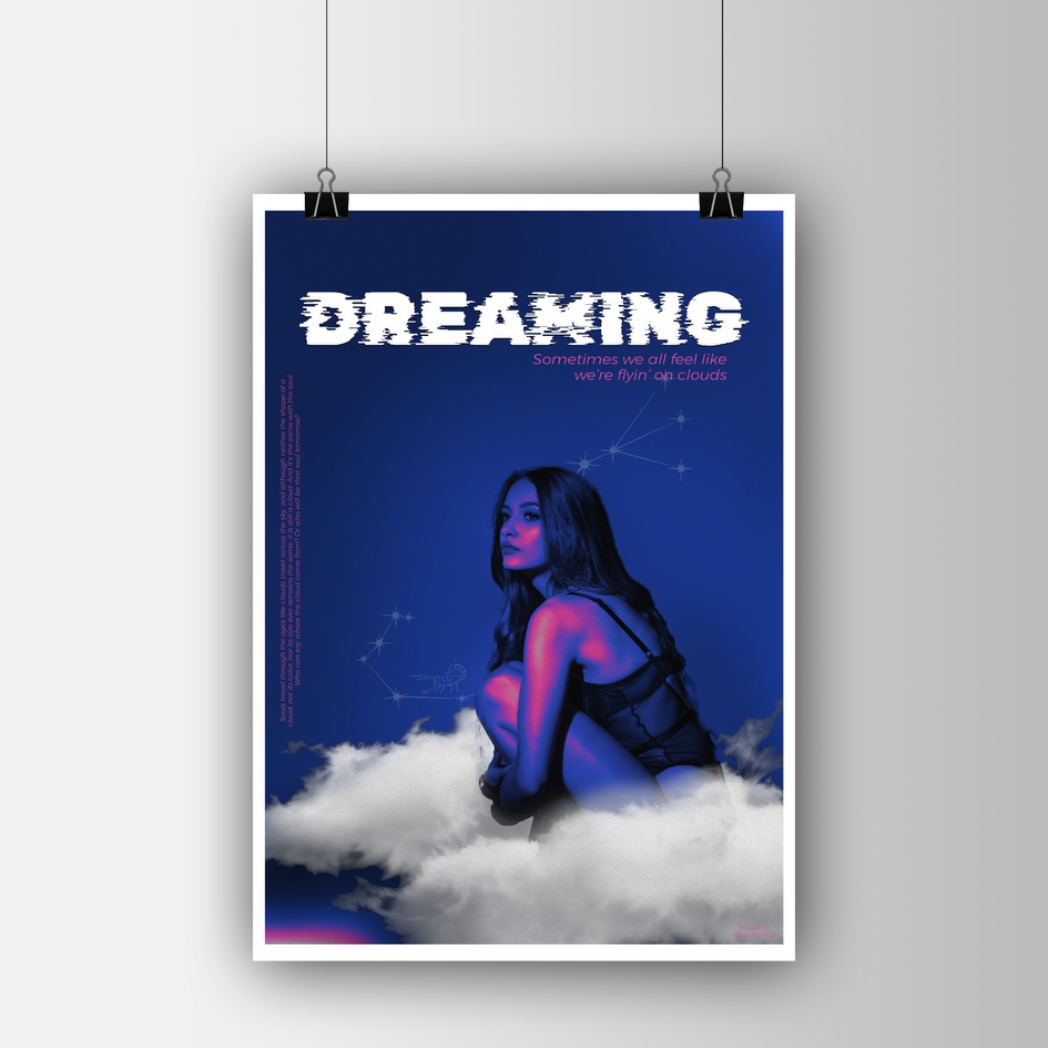
Dreaming
04
Life